
My Top Ten Tips on What to Wear for Family Photos
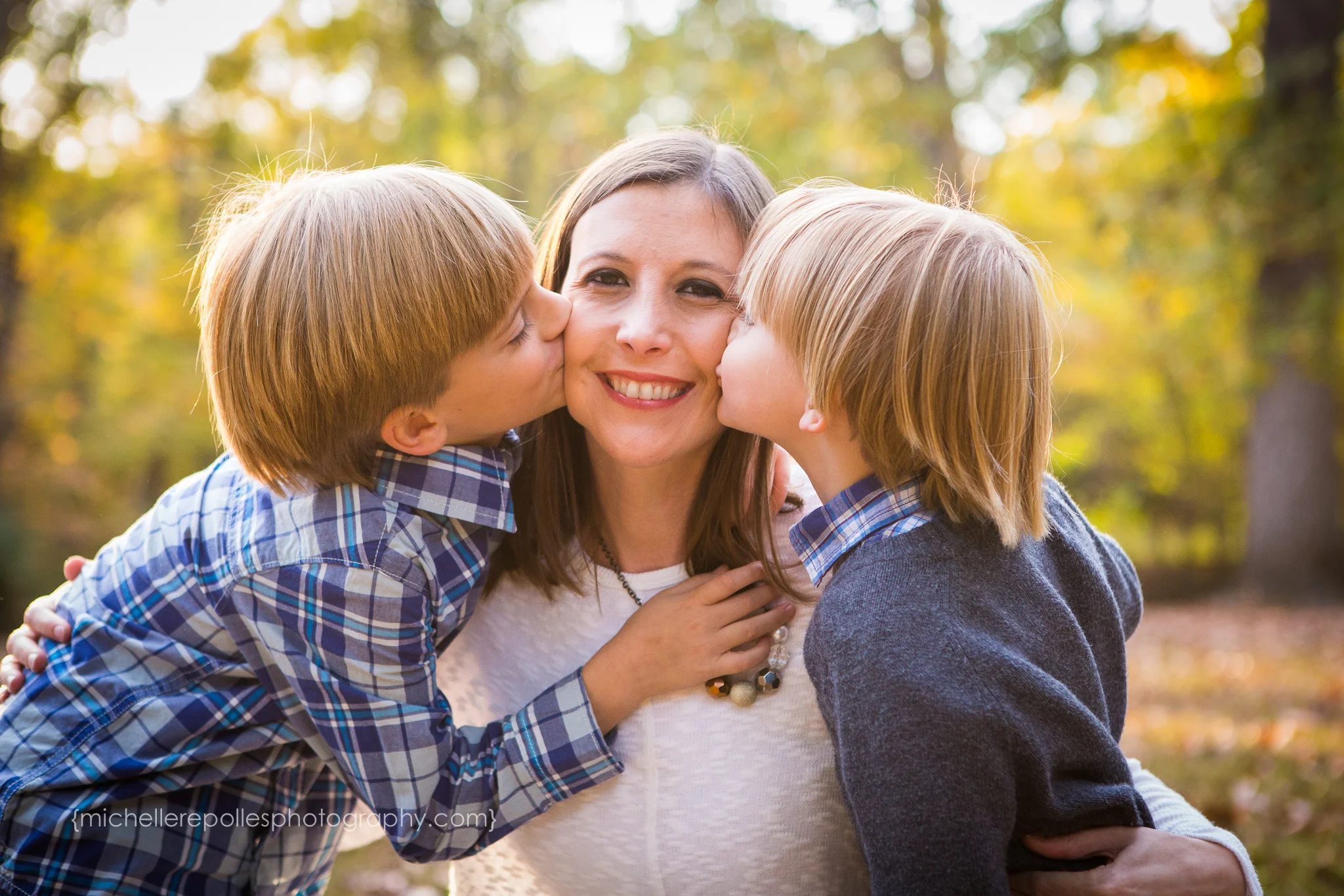
1. Mama, you get to go first this time. Yes. This time you don't get the leftovers. You've earned it! Pick what YOU feel great in and plan around that. Moms aren't used to getting the attention. Typically we pick everyone else's outfit then grab something that's "ok" but not necessarily what we love. You have permission to feel awesome in your images. I know if I don’t like what I’m wearing in the photo, then chances are I won’t have it hanging on my wall or on a Christmas card.
2. Choose whites and blacks wisely. The tendency is to lose details when those colors are next to each other. Think about getting in a tight photo with your family and it's white, on white, on white, or all black. It becomes a blob of one color and variation is lost. Now, don't get me wrong. I have photographed families in all white that were gorgeous, but the girls' shirts were light, airy, and sleeveless. The skin tones were a beautiful way to break up the white. What I am saying here is if you do choose all white or black, don't choose stark whites and the blackest blacks. Whites and blacks are not completely off limits if you do it well.

3. Use the color wheel to help. I went over this in my Facebook live video here, but you can get a summary below. Keep reading...
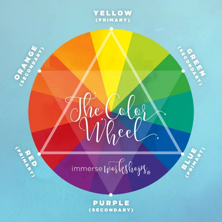
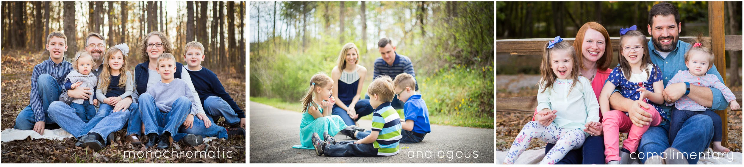
There are three terms to consider when picking color schemes: monochromatic, analogous, and complimentary.
- Monochromatic: using all the colors (tints, tones, and shades) of a single hue. Now I know what you’re thinking. She just told me to stay away from that with white or black. What I mean by using one color is using different tints or shades of the same color. For example, you decide to pick gray. You can mix dark grays with light grays. Blues – navy blues with light blues. Make sense?
- Analogous: Groups of three adjacent colors on the color wheel. Let’s pick blue again. Analogous colors would be blue-green and blue-violet because they are adjacent to blue on the color wheel.
- Complimentary: Colors that are opposite each other on the color wheel. Ever wonder why the sky looks especially blue during the fall when the leaves are orange in all their glory? It’s because orange and blue compliment each other. How cool is that? Imagine what complimentary colors can do for your photos. This doesn't mean to pick all of the brightest colors, but you can even use different tints or shades of complimentary colors. There are just SO many options!
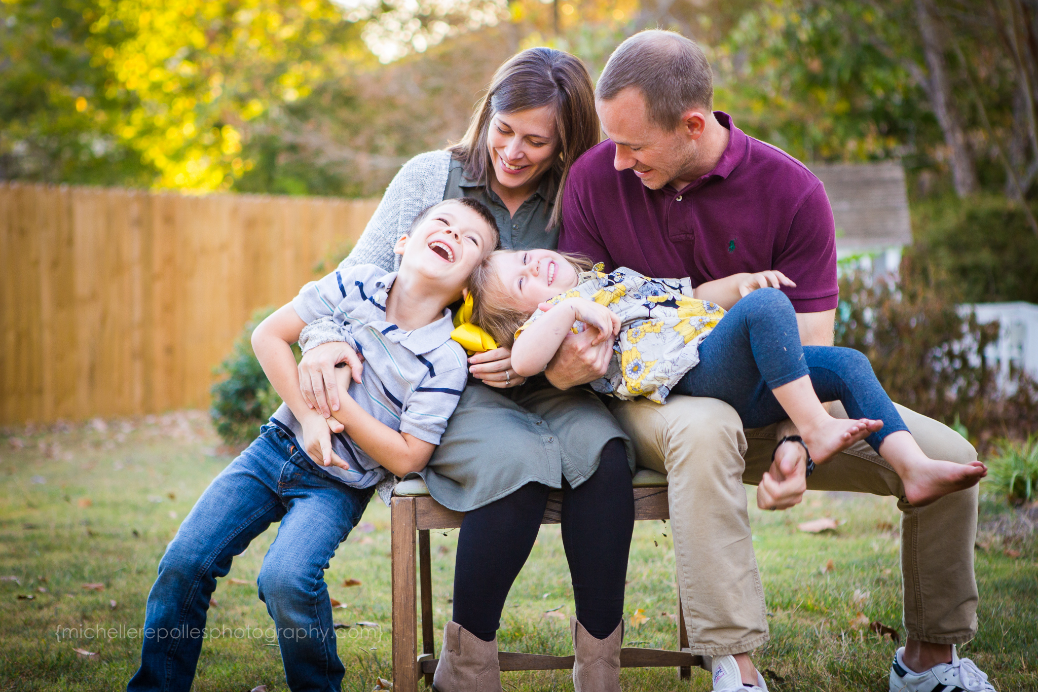
4. Look in your husband’s or son’s closet to inspire you. Thought I’d never say that! Is there a plaid shirt of your husband’s that you love? I’m guessing there is a combination of colors that you’ve never even noticed, but you knew you loved the shirt when you first saw it. My husband has a red shirt that he loves, and if you could look closely there is a faint green line through it. Bam. I realized my younger son has a green shirt that exact color of green, so I just went with it. And, green just happens to compliment red. Sweet!
5. Add in some texture and accessories. Scarves, sweaters, chunky necklaces, and bracelets are great for this. How about a kid in a leather jacket? Even though it’s a darker color, our eyes tend to notice it right away because of the texture. Or how about the texture of this sweater on the little guy below? Adorable!

6. If you throw in a pop of color, do it on more than one family member. If one person has on bright pink, your eye will automatically be drawn to that one color. (Imagine a bright pink bow in a little girl's hair. What happens? Your eye is automatically draw to the pink bow.) But, if you mix the pops of color throughout the photo (pink here and there, or pink here and a bright shade of yellow there), your eye will move across the image without being fixated on that one spot. We want our eyes to scan across the photo and everyone to be noticed.

7. Think about where your family photo will be showcased in your home. I’m so glad I started including a large print with my sessions because I want nothing more than to know it is being enjoyed in your home. Knowing where it will be hung can help you decide what colors to wear. If you’ve got one color scheme going on in your home, but the colors in your photo clash with it, the likelihood of you actually enjoying it on your wall will diminish.
8. Don’t be afraid to ask for help! I LOVE helping narrow down choices. If you are my client, feel free to take a photo of all of the outfits next to each other and send it to me. I’ve had moms send me photos of three different shirt options asking me my favorite. Now, I’m not fashion guru, but I think I have a hunch of what photographs well and I really want you to feel confident going into your session.
9. Let your favorite guy wear something he likes in your family photo. (Dads and husbands are all high fiving me right now.) For a lot of them it’s hard enough to have their picture taken, let alone wear something that is uncomfortable and not “them”. Give him a few choices and let him have some say about what to wear. You will all be happier and he will be more likely to feel good on the family "outing".
10. Keep the main thing the main thing. These are simply guidelines and are by no means hard and fast rules. (However, I do hope they have been helpful.) When it’s all said and done, the best thing about the photos will be your interaction with one another. Clothing choices are important, but how our hearts are on the day will be what really shines through. Keep it as stress free as possible with comfortable clothes that your family members feel good in and that allow each person’s personality to be captured naturally.
So, what are some of your favorite tips and tricks for styling your family on your session day? I’d love to hear your thoughts on this.
I also have helpful tips on how to prepare for the actual shoot, what to bring, etc. You can get the FREE printable of my checklist below.